When I undertook the complete overhaul of CM's brand and identity system, I approached it with the understanding that core to how the world interacts with your brand begins with how they perceive you. Who are you? What do you stand for? Are you selling 'things' or solutions that improve peoples lives? Through deep-dive interviews with stakeholders, employees, and some of our core customers, I established a rooted understanding of these questions and found who we thought we were wasn't translating to our audiences.
Perception travels halfway around the world before reality even gets out of bed.
Ten steps to building a brand
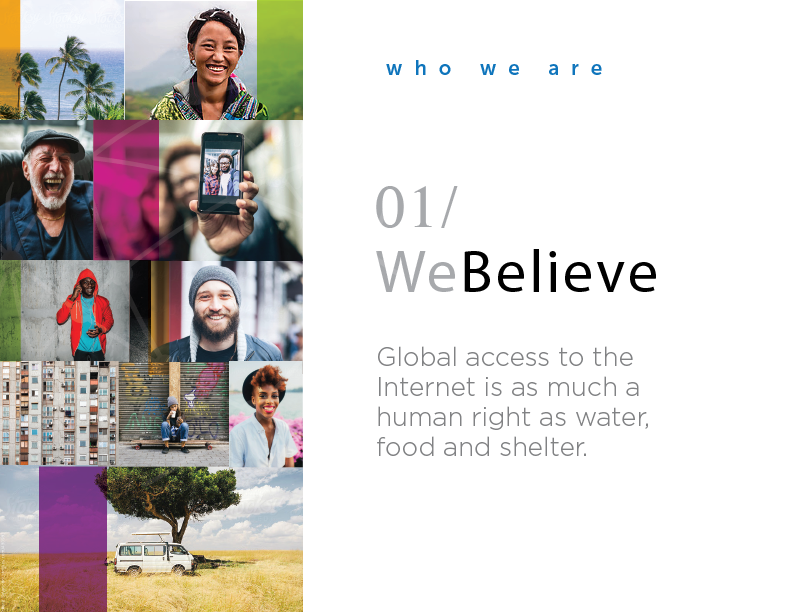
Step 1. Who Are We?
Crafting a clear vision and voice for of company were among my first steps. After intensive research I determined an important insight - We are Human-Centric at our core. Human-centric is defined as a social ecosystem, deliberate in its design and development, and which strives to act equitably and evolve in a way that delivers empathetic solutions into the world. This is who we are and how we wanted to the world to see us.
Step 2. Who Are Our Users?
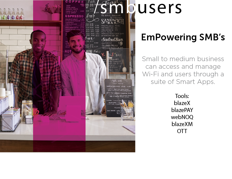
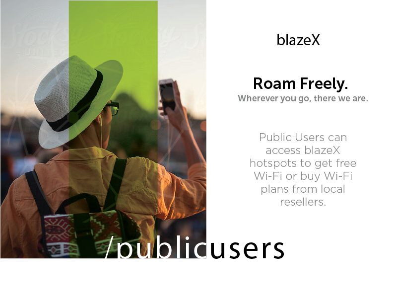
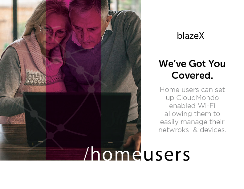
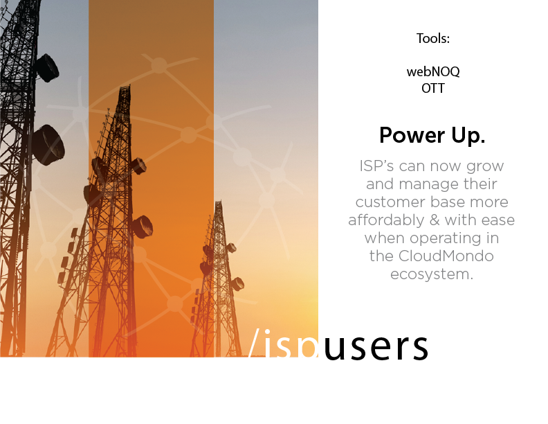
Defining our users, their businesses and the challenges they face on a daily basis allowed us insight into their world and clarity on how we could position our products that would serve them in the best possible way. We looked at the people, their cultures, the markets, and verticals they operated in, then defined and aligned them with our products.
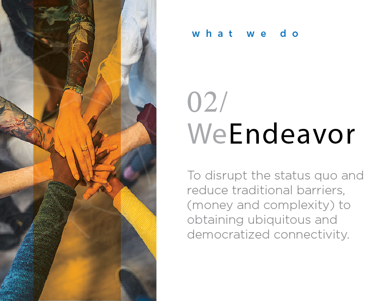
3. What's Our Vibe?
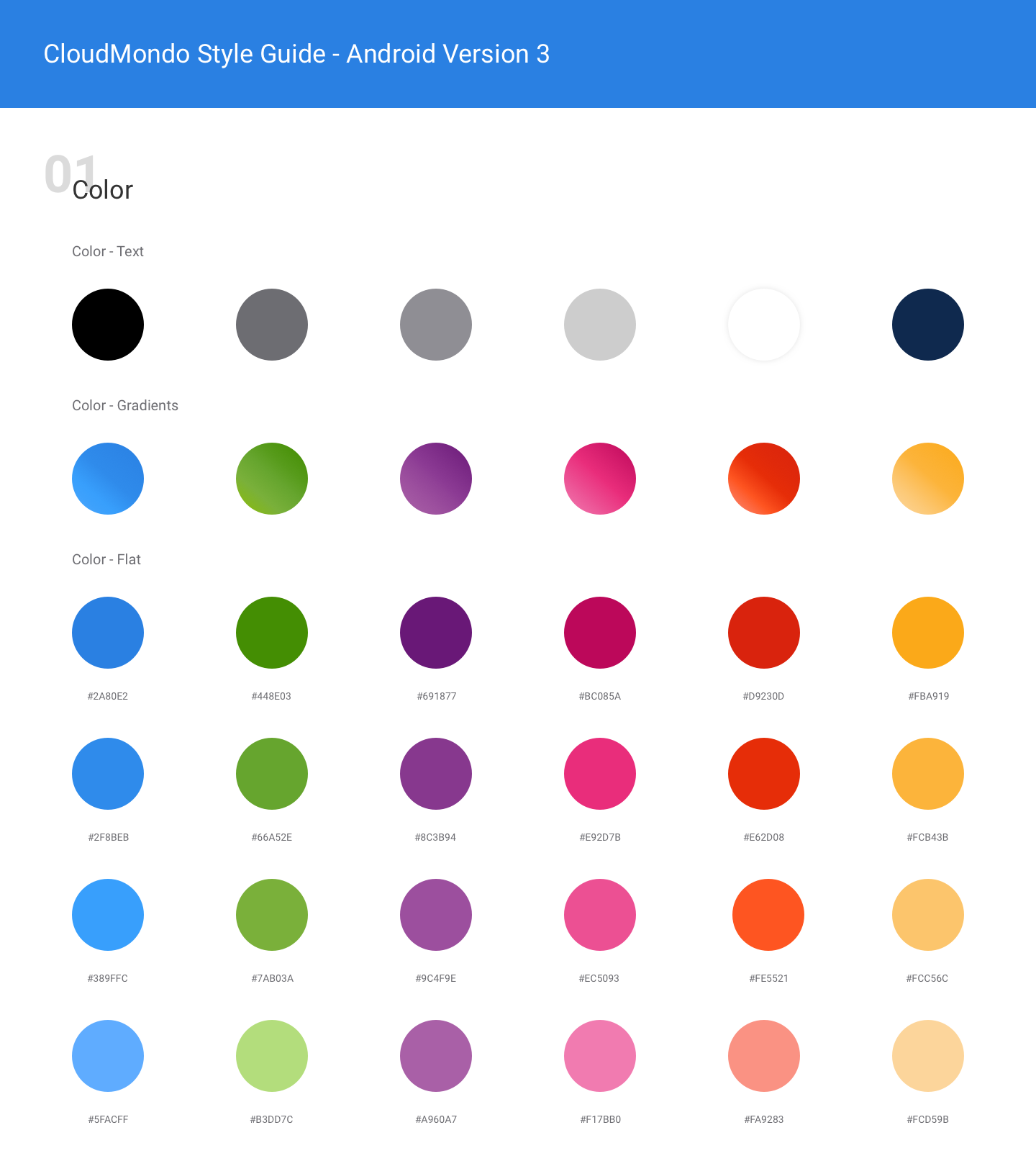
Because our users and products were global, crossing continents, cultures, and industries, I established the brands color palette to reflect that eco-system. I sourced images of users from different countries and in different environments and pulled our colors from the real worlds we would be engaging with. Choosing to work with a palette of gradients rather then single pantones allowed for a richer, deeper, and more humanistic connection.

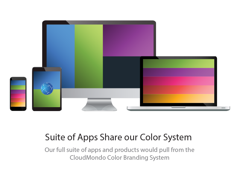
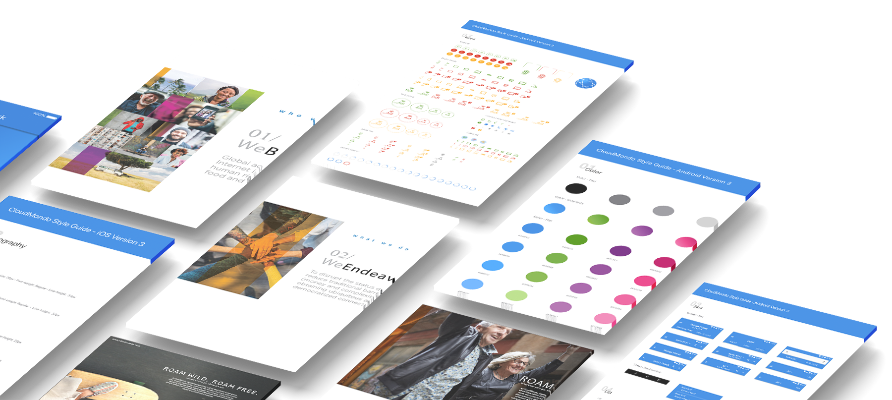
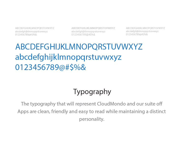
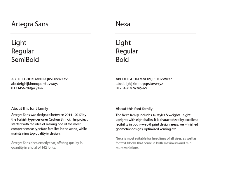
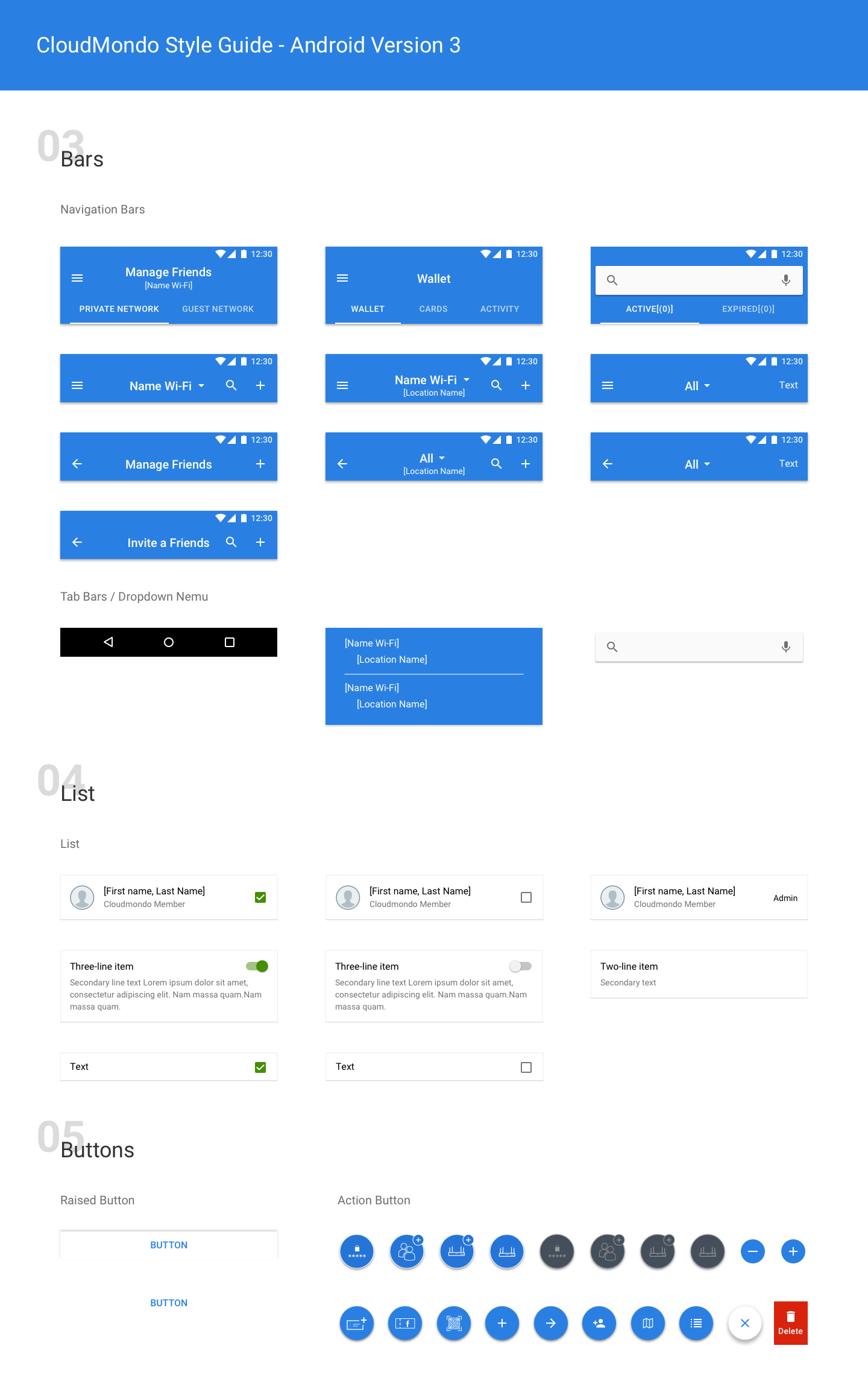
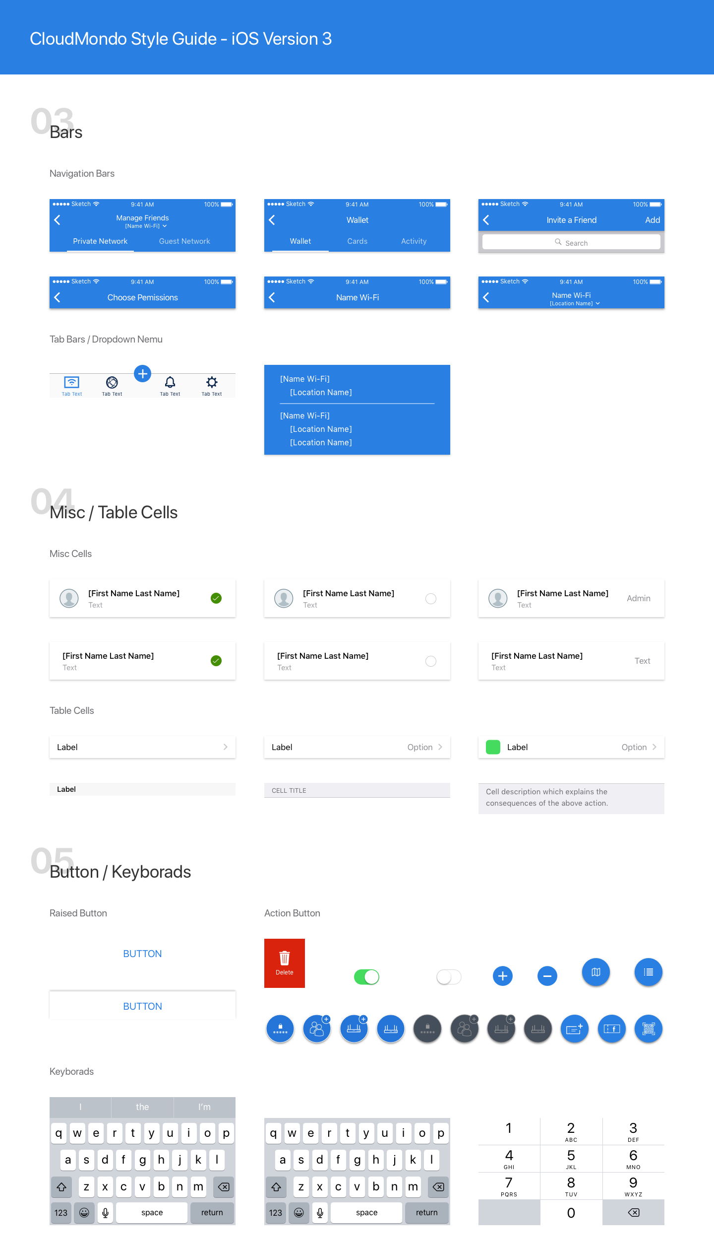
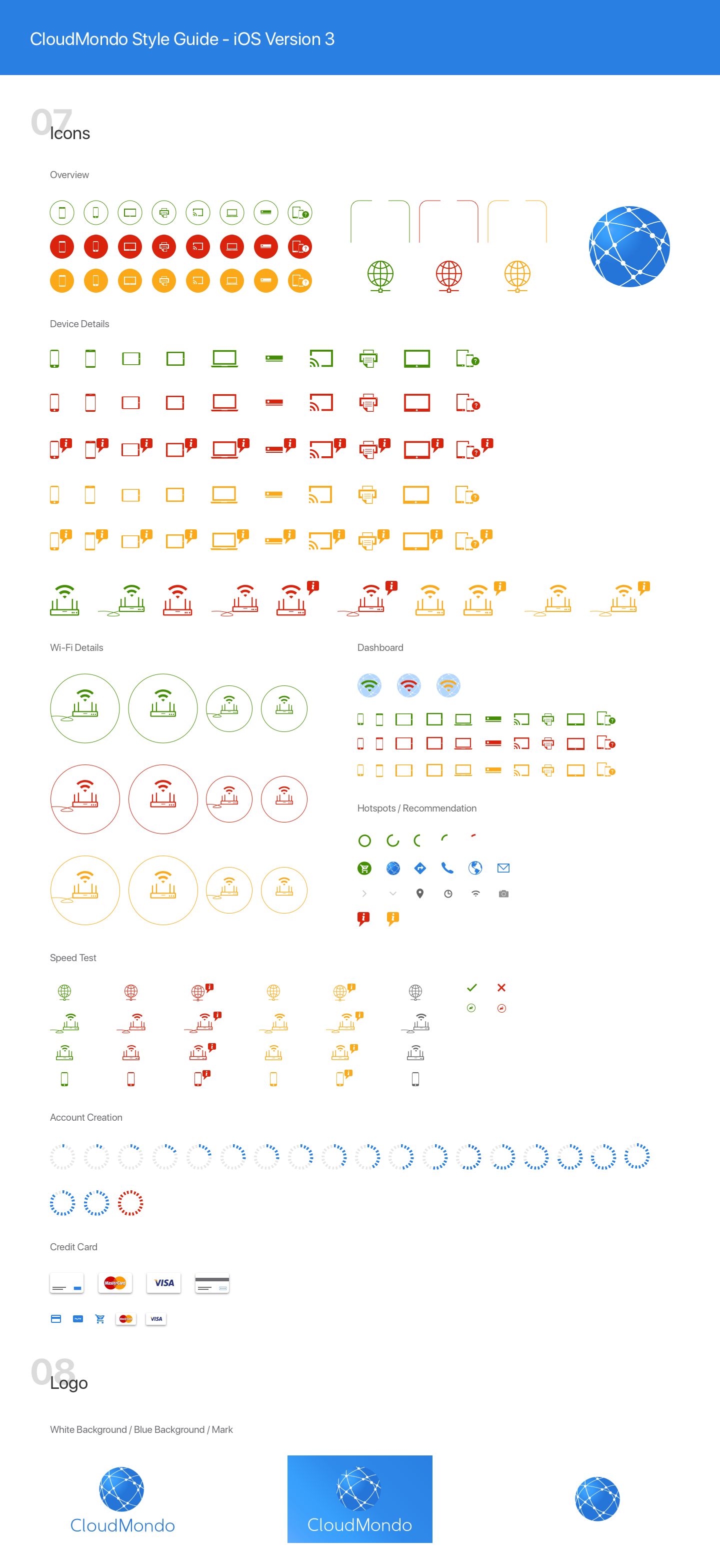
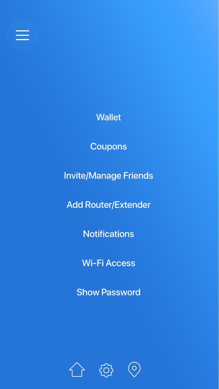
4. Nailing Down a Cross-Platform Design System
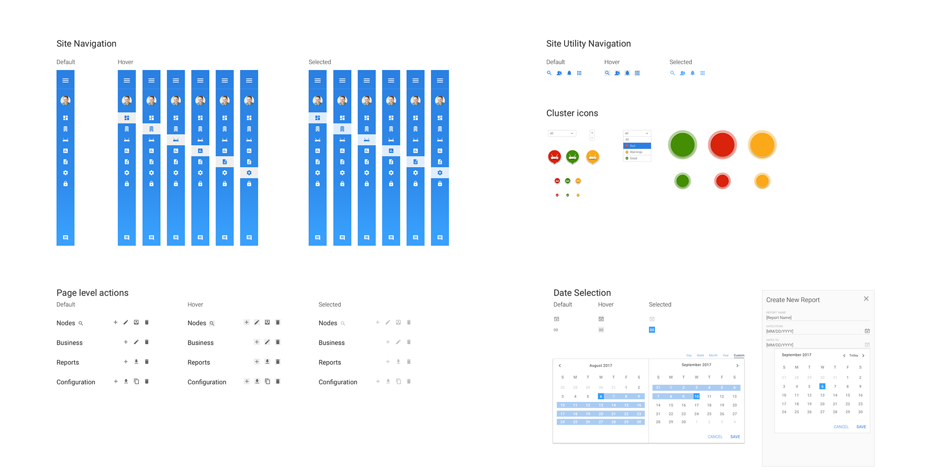
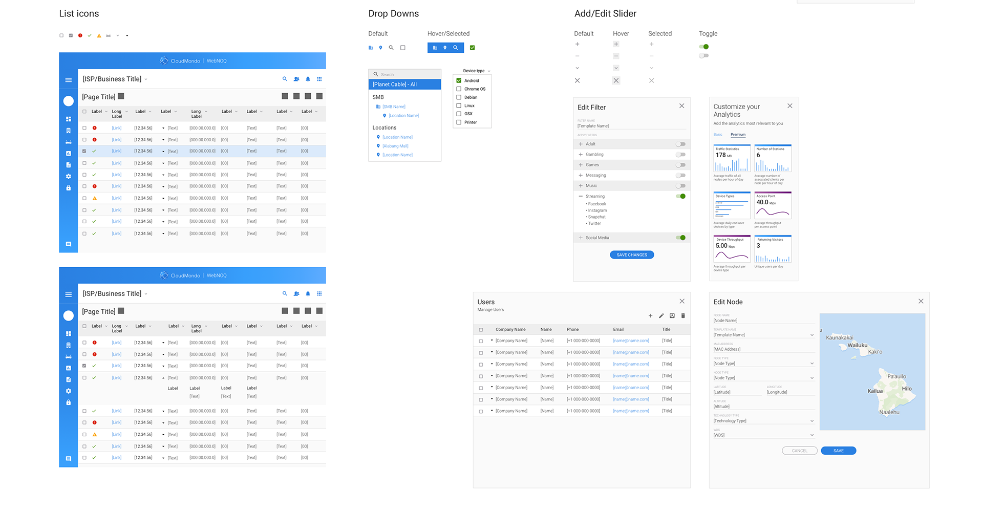
The ability to scale across product lines, markets, and verticals requires a clear and established library of typography, iconography, patterns, buttons, navigation, functions, gestures, nomenclature and more. Below are samples of some of a few of the living libraries I put together to begin to establish a foundation from which we could draw from. The libraries were created across product systems including web, print, desktop, IOS, and Android.
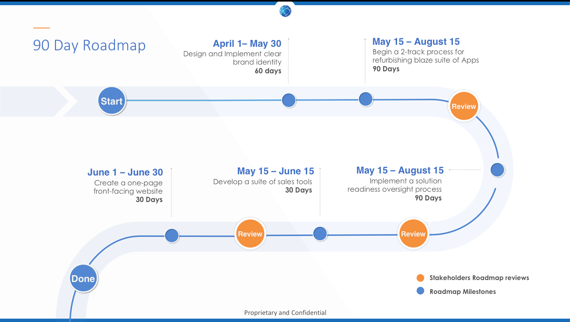
5. Road Mapping Our Goals
With our brand knowledge and insight locked in, it was time to begin the work of overhauling our existing products UX. Creating a 90-day roadmap allowed me to see both our big picture goals as well as the granularity of our day to day.
Our Short-term goals
- Research, test and uncover pain points & issues with current apps
- Prototype and Ideate high-fidelity designs and functionality
- Present to Stakeholders, identify and refine
- Collaborate with engineering to build final prototype
- Apply new design, patterns, and standards to other apps
- Launch campaigns to support brand vision and mission
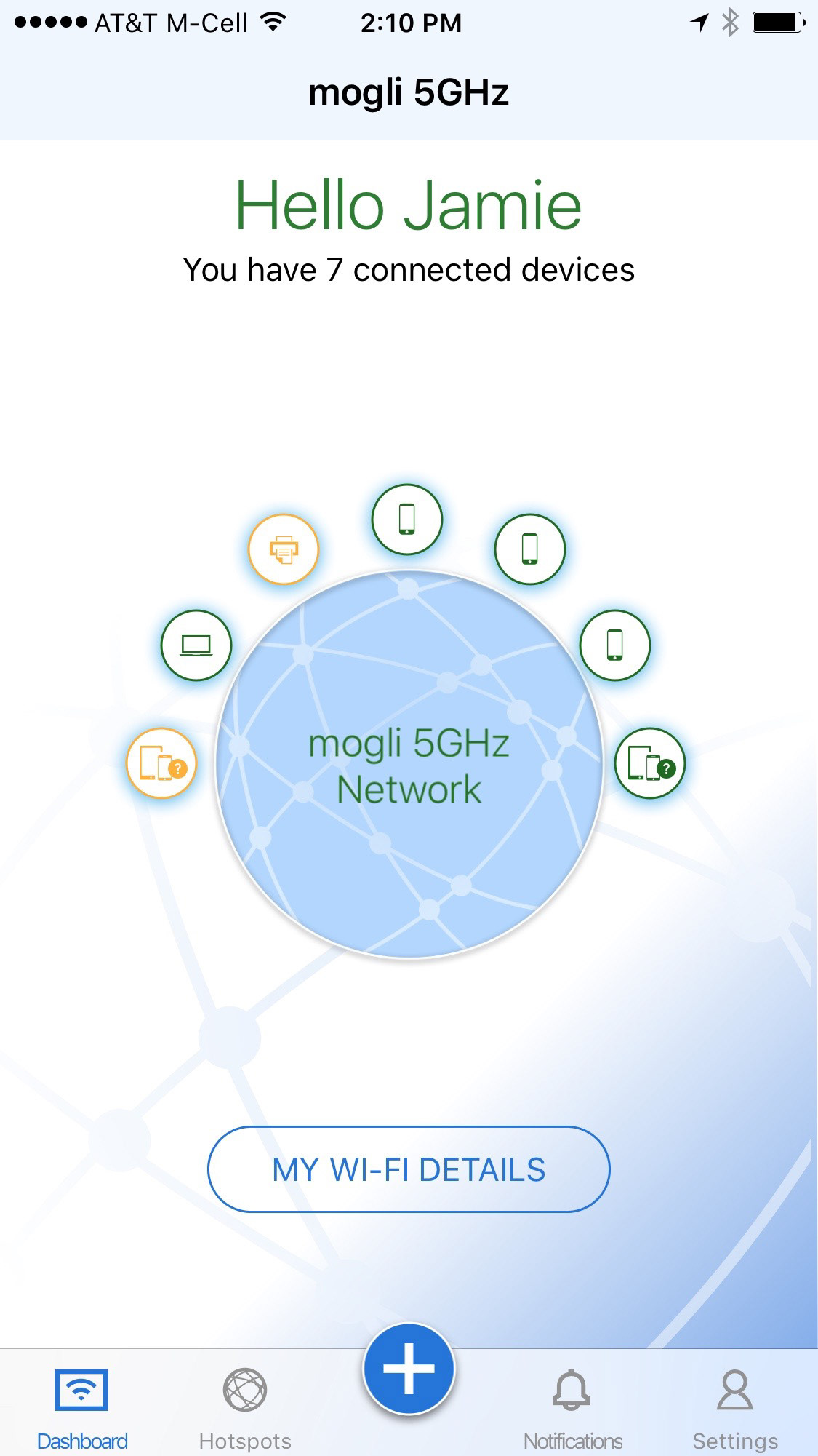
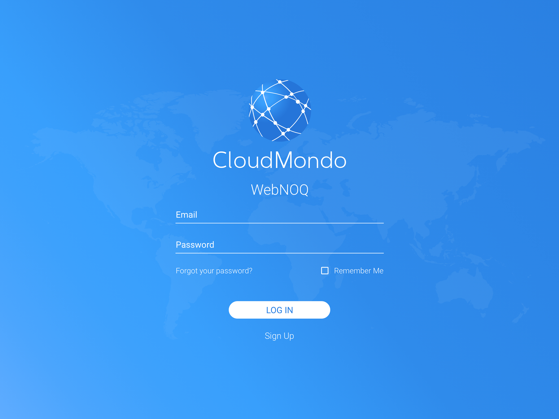
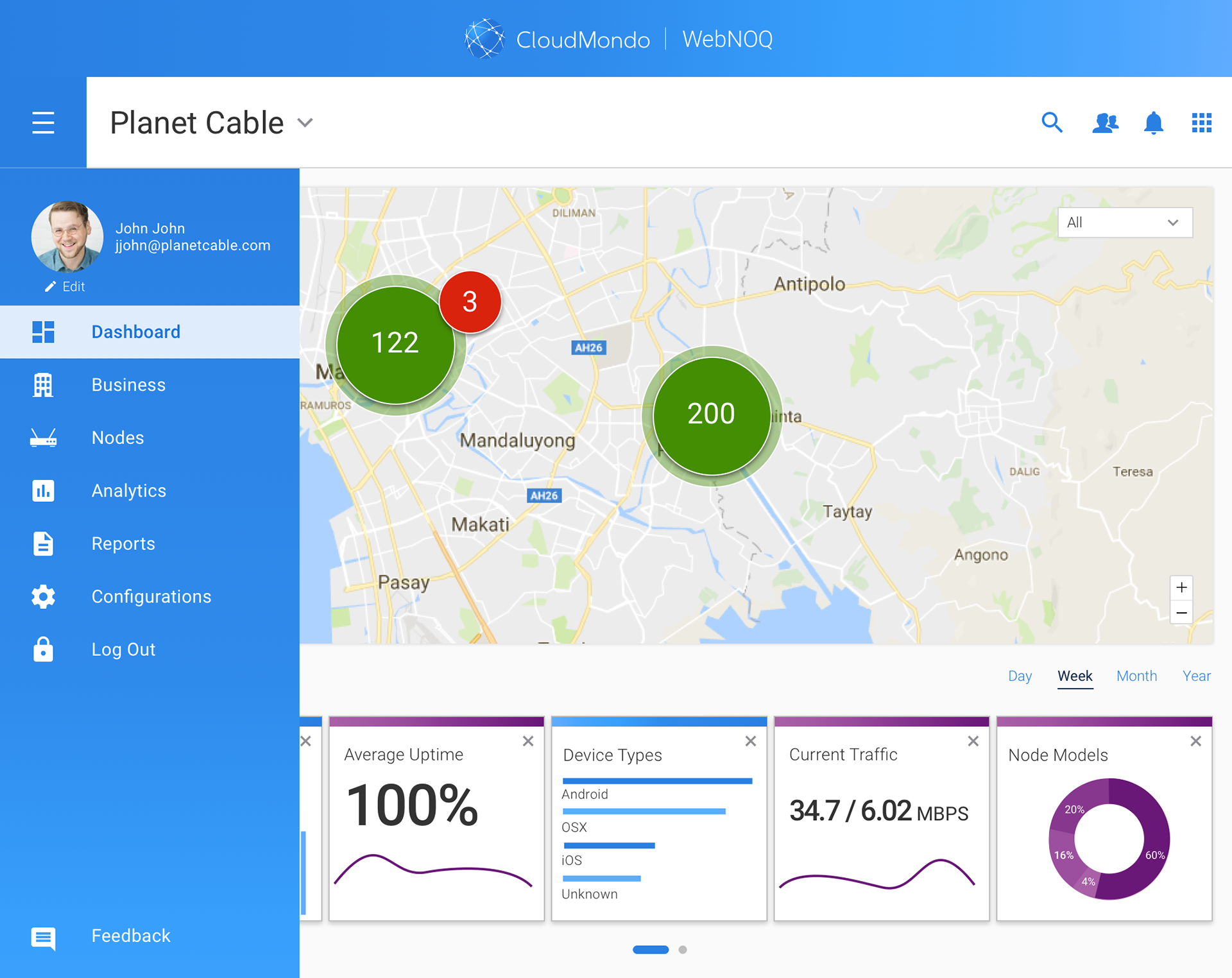
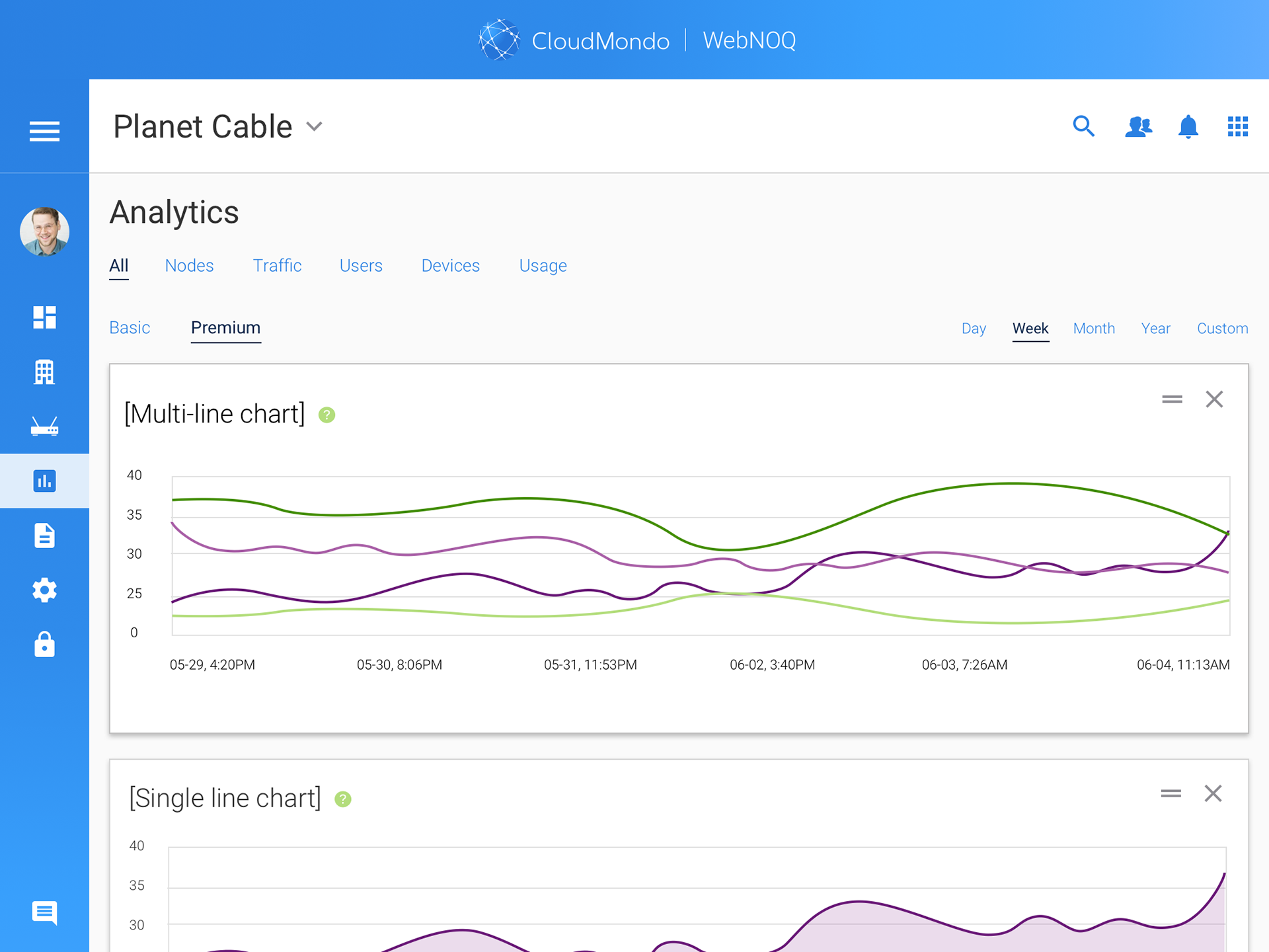
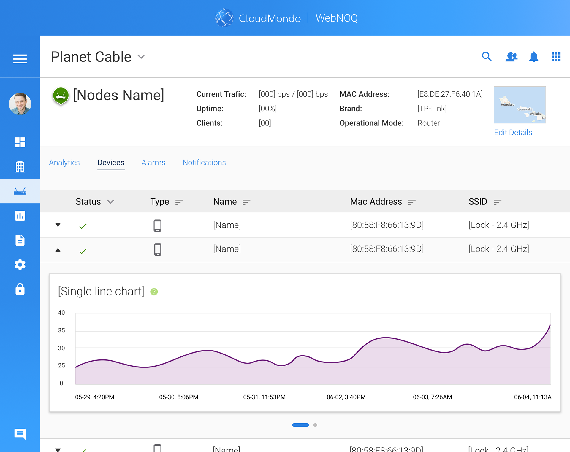
6. Research, Test, and Assess
First steps in moving forward is assessing where you are and establishing a baseline for what's so. Where do the disconnects and pain points happen? Is our vision, brand, and user experience translating to our users? I uncovered and defined dozens of areas where the design and UX were'nt working or showed inconsistencies with our brand and visions.
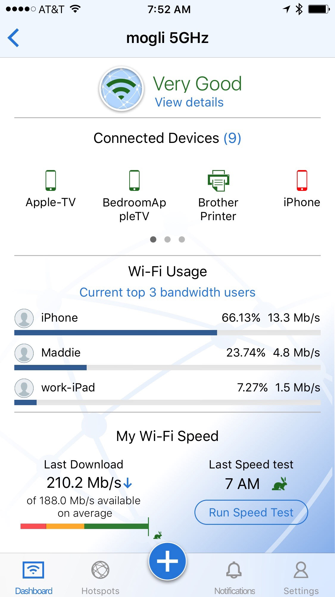
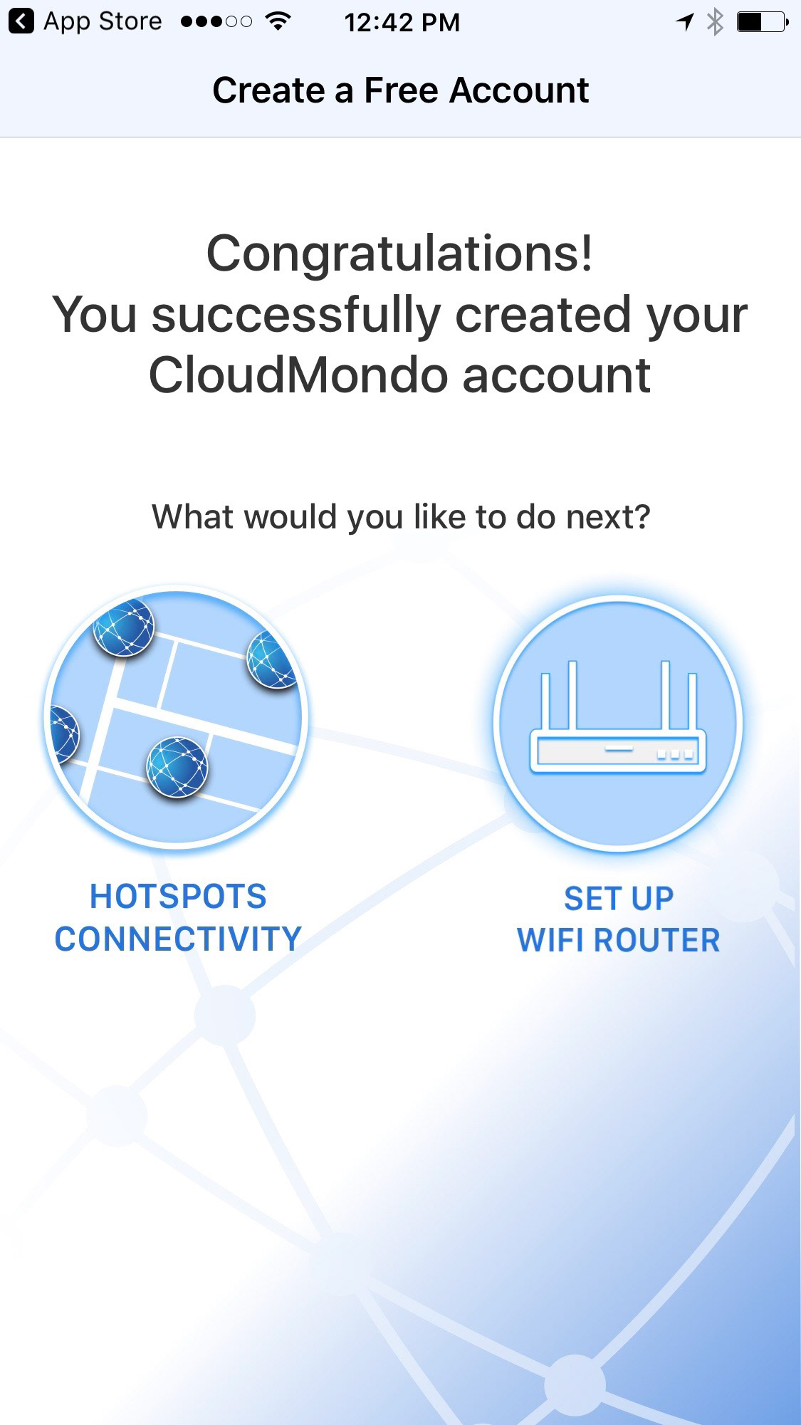
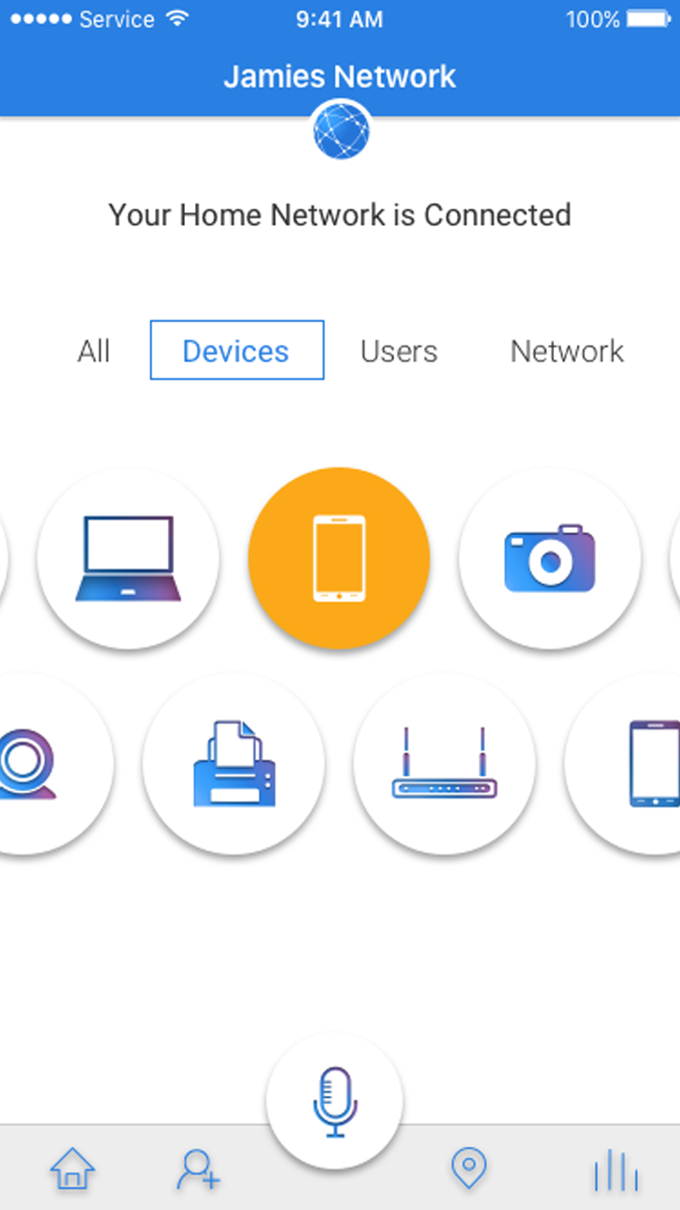
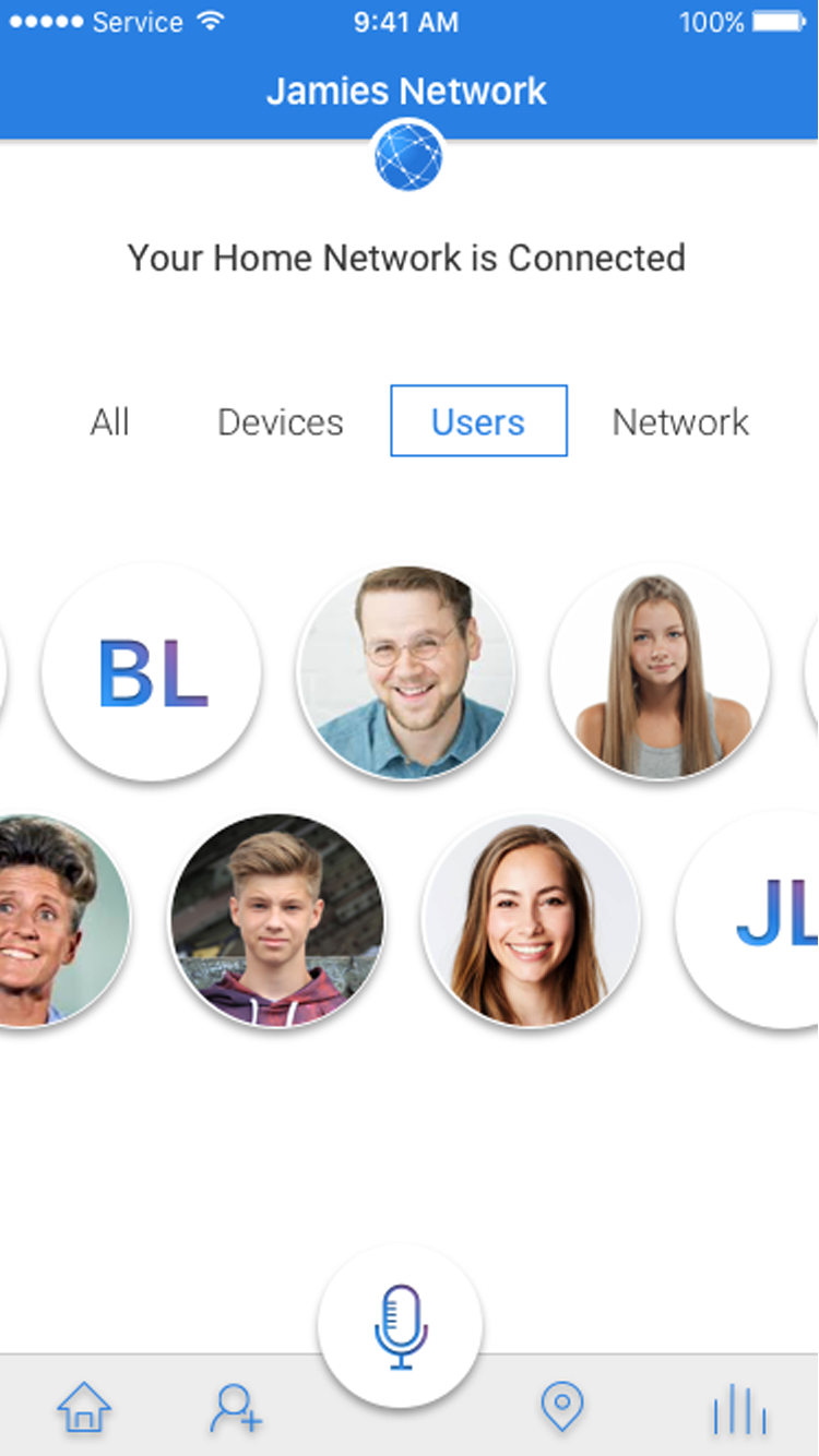
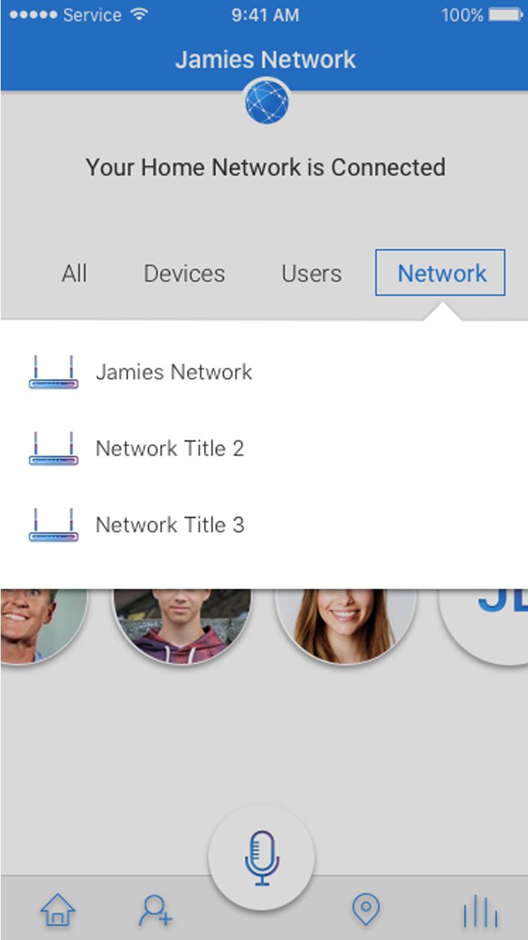
A few major issues I uncovered: (screenshots below)
- It wasn't clear what the app did or how to engage with it
- Colors were dull and lifeless limiting people's desire to engage
- The dated design failed to communicate our cutting-edge AI and technology
- Text was too small, hard to read, and confusing
- Nomenclature was inconsistent
- Use of Android and IOS patterns were confusing and inconsistent
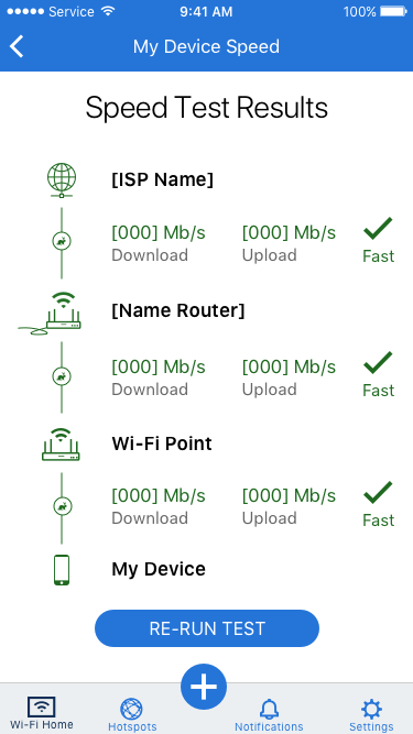
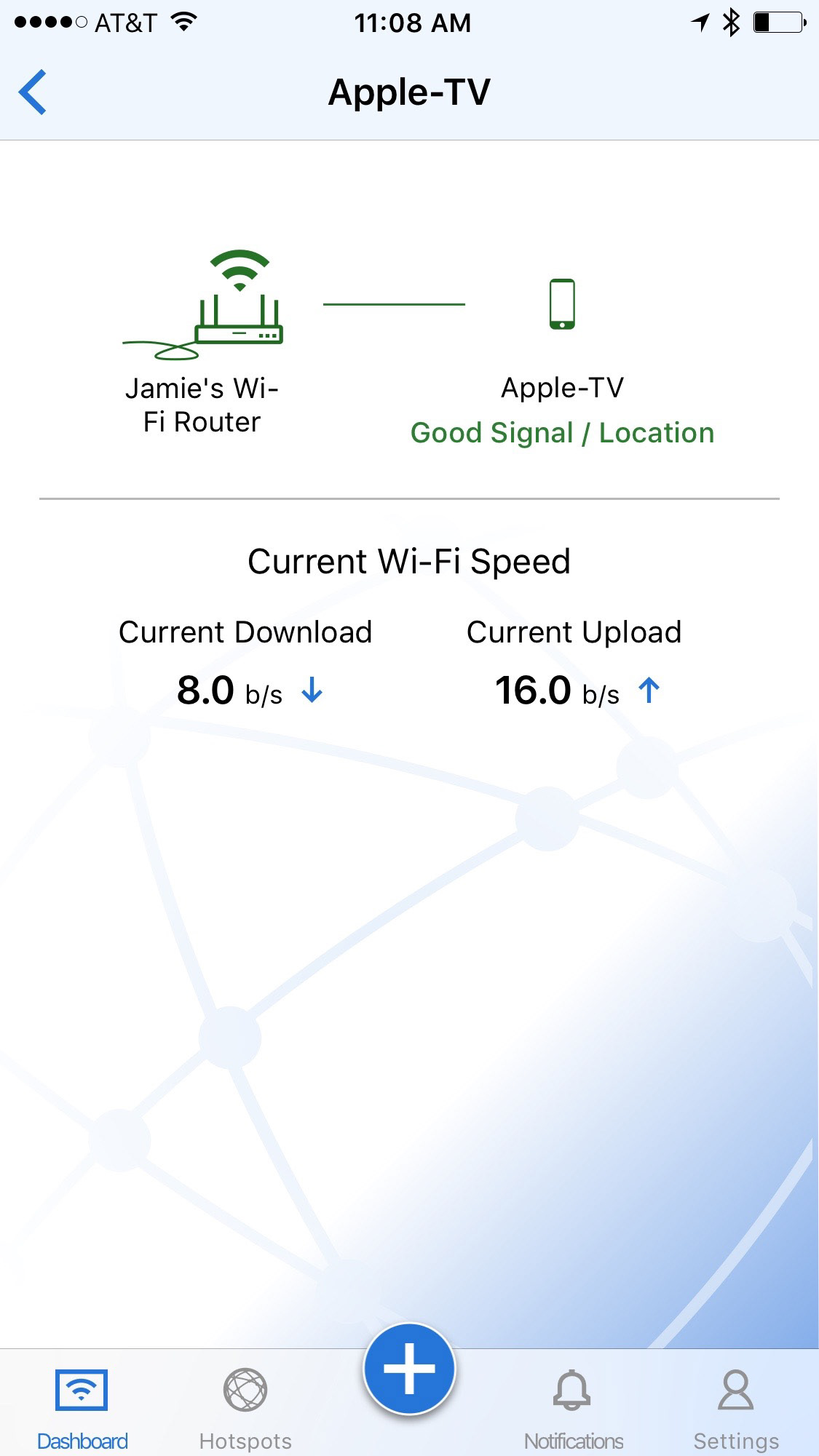
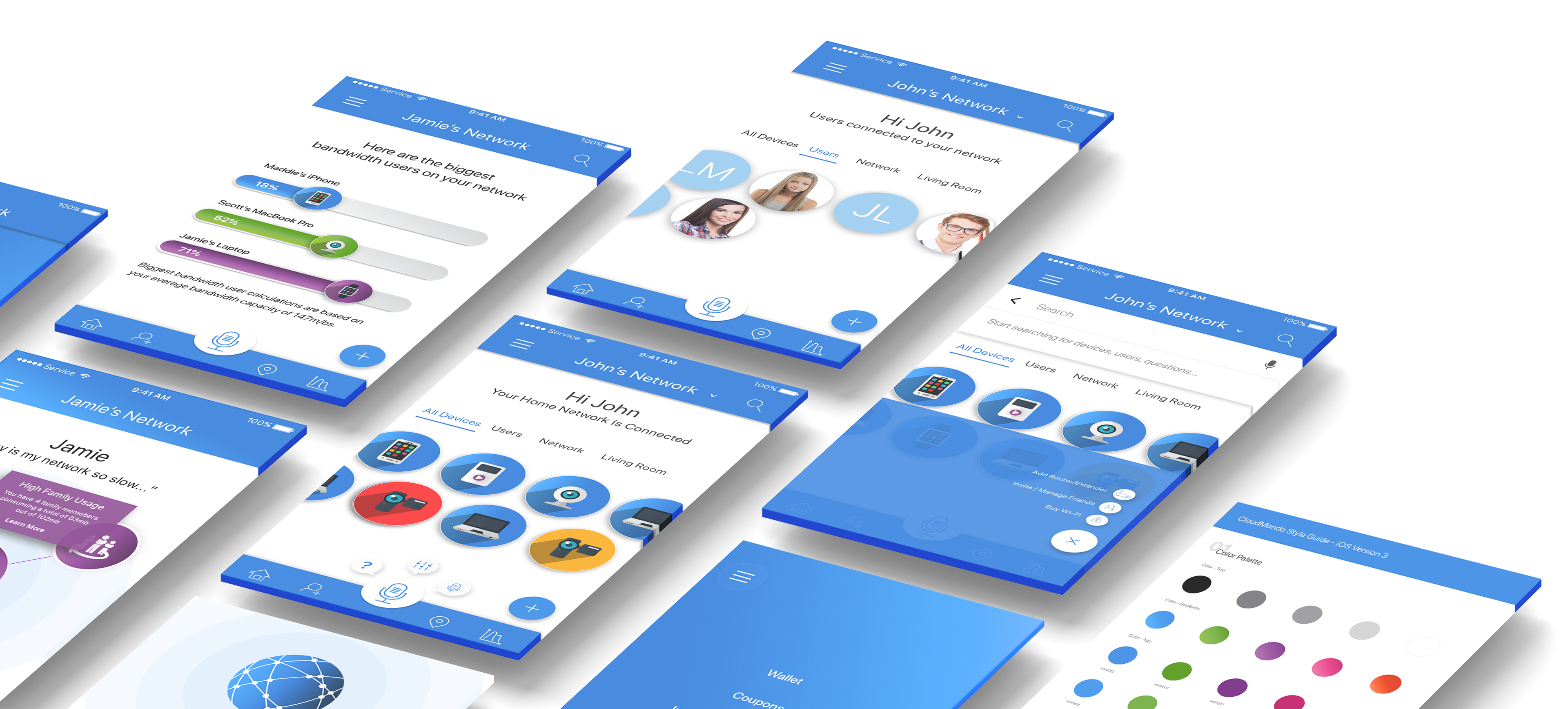
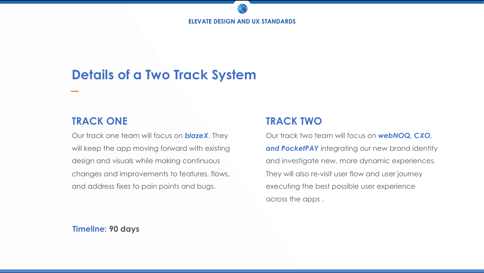
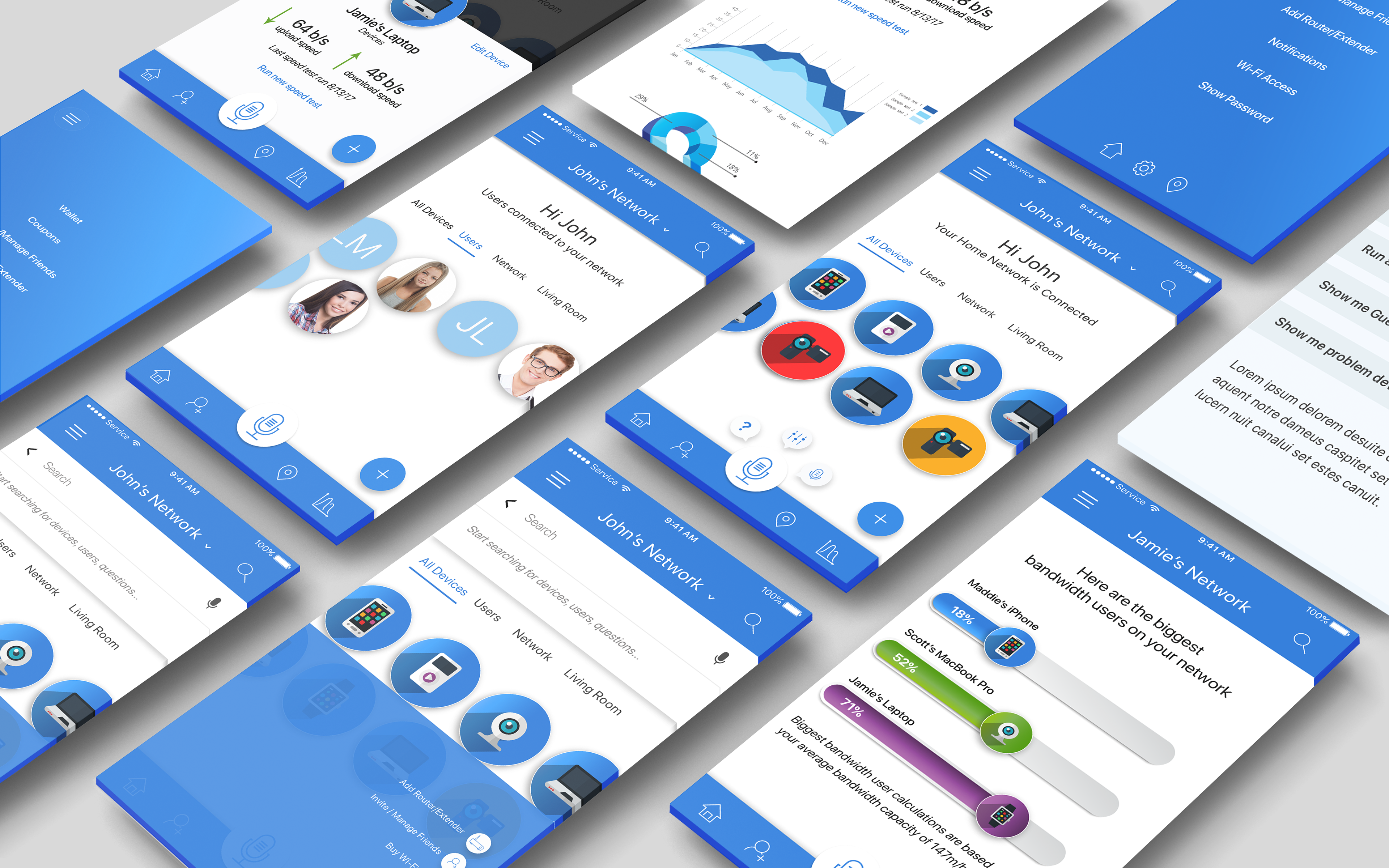
7. Prototyping Phase Begins
Drawing from our newly established vision, brand, voice, tone and design systems, I began the mock-up and prototyping of a new core system of apps. I investigated, developed and presented a variety of directions and brand avenues to stakeholders, CXO's, sales, and cross-functional teams to identify and refine vision and direction. I focused on color, iconography, skemorphic realism, micro-interactions, and a simpler way to manage your entire connected world from one place.
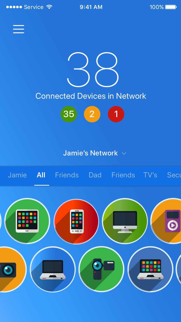
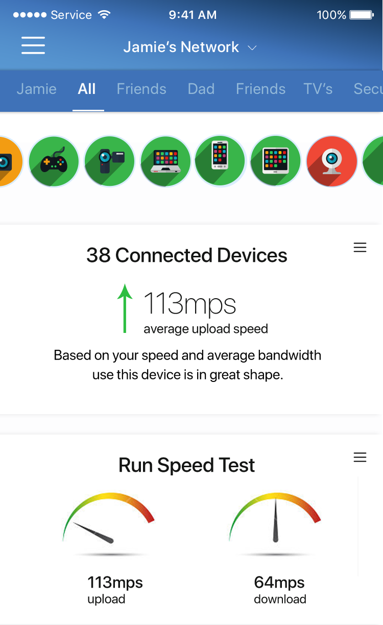
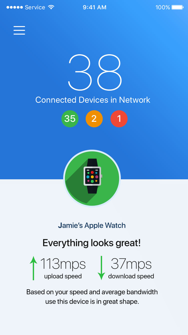
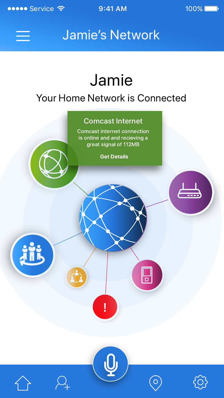
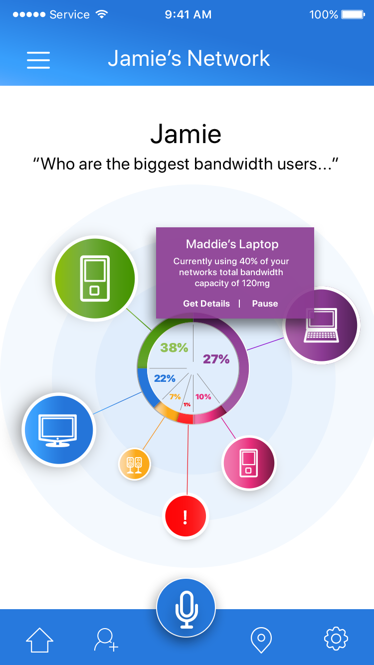
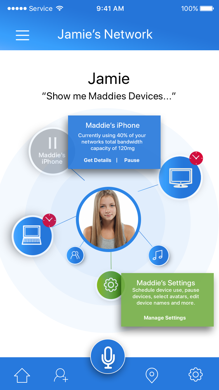
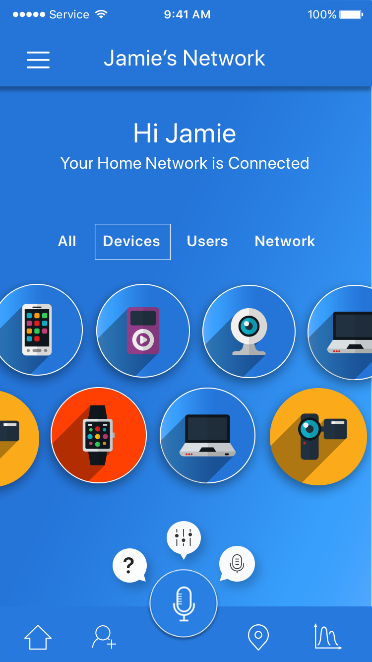
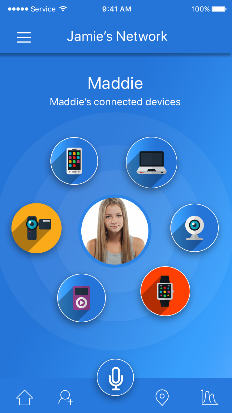
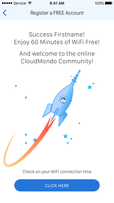
8. First App Begins to Take Shape
Weeks of refinement, testing, presentations and debates with stakeholders and teams, the final app designs begins to take shape. Skemorphics iconography was locked in, micro-animations and gestures were designed, IVR voice commands, smart searches, and deep AI became the core elements of the new app I called, IQ.
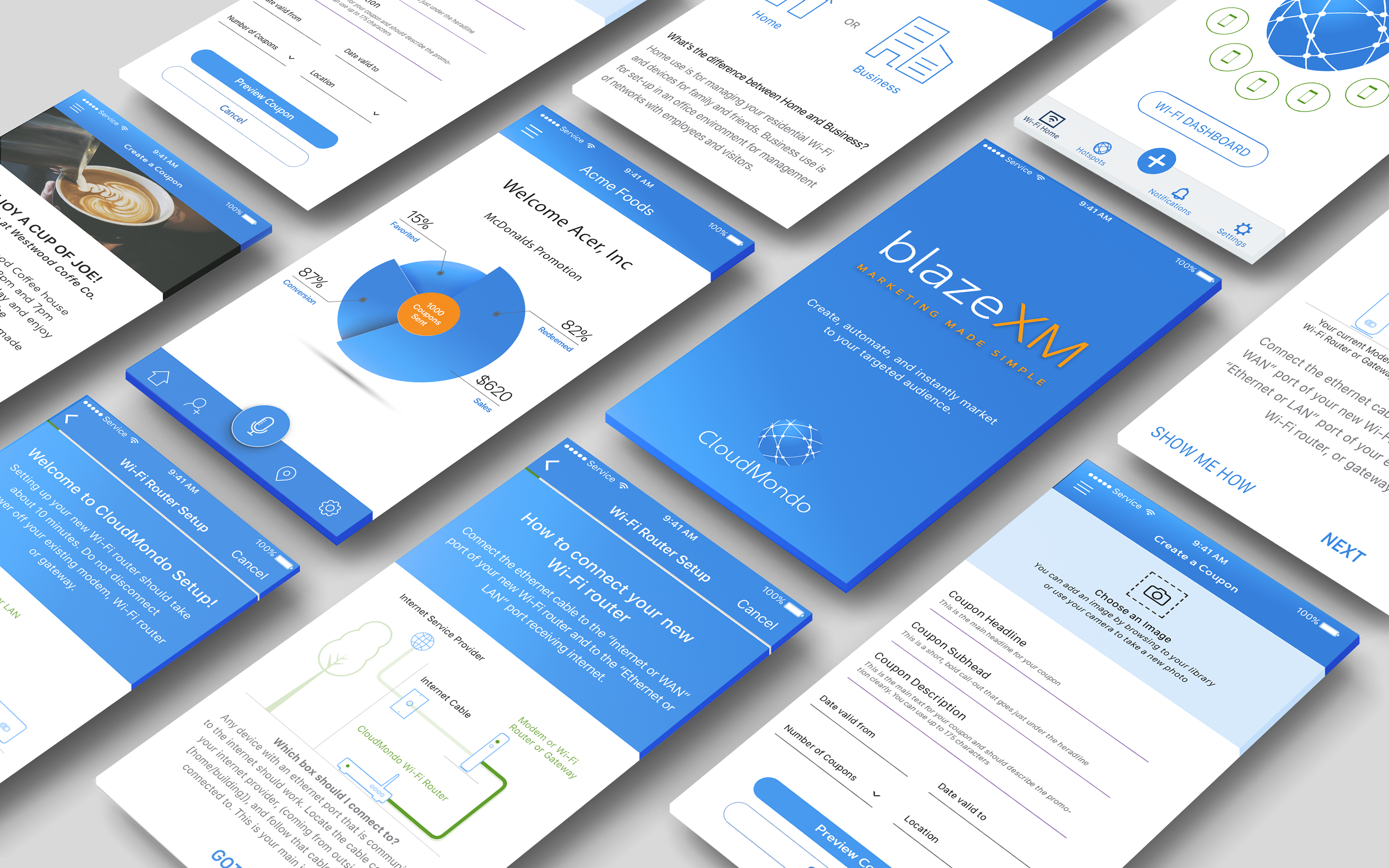
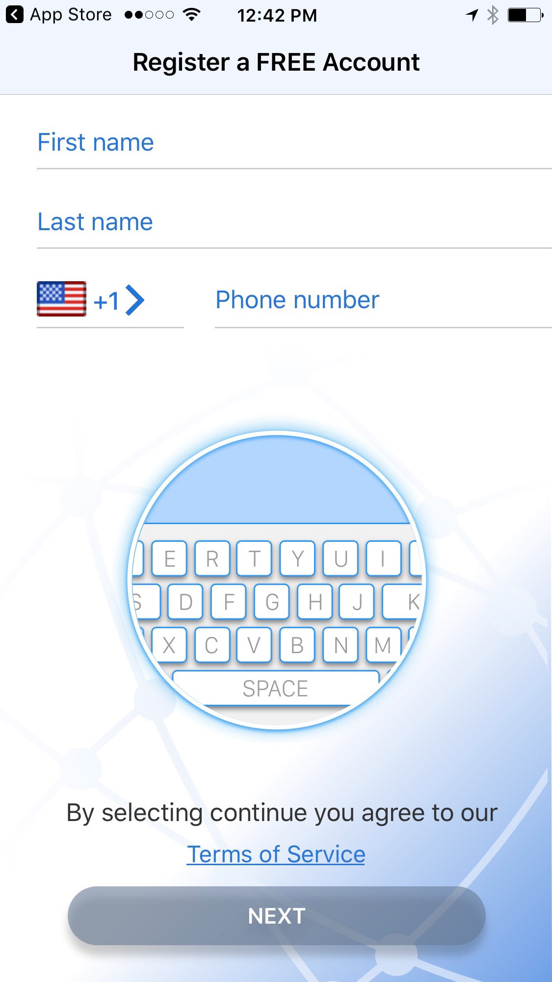
9. Bringing the Rest of Our Apps Up-to-date
With the new suite of Apps underway, I turned my teams focus to our web based software app that ISP's and SMB's were currently utilizing in their day to day network operations - but were experiencing similar pain points. Working closely with stakeholders and engineers we researched, tested, wireframed and overhauled the design and information architecture to create a simple and intuitive user-interface that anyone from a seasoned IT professional to the 'mom and pop' small business owners could use with ease.
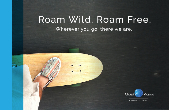
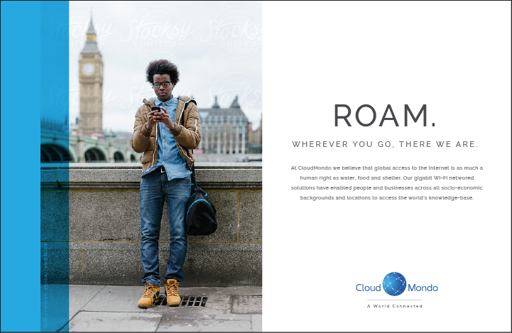
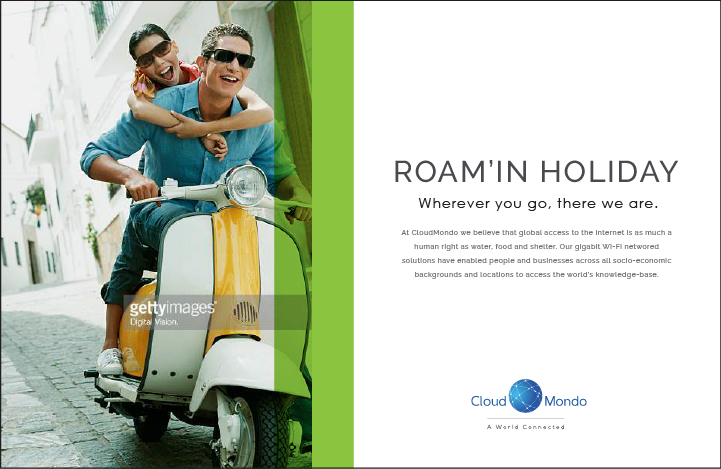
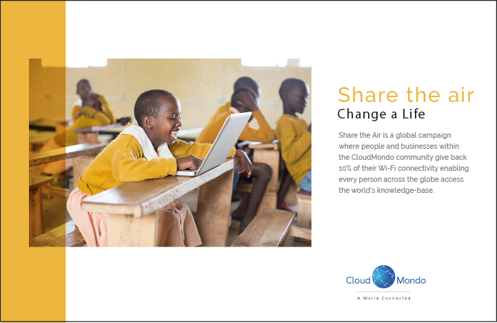
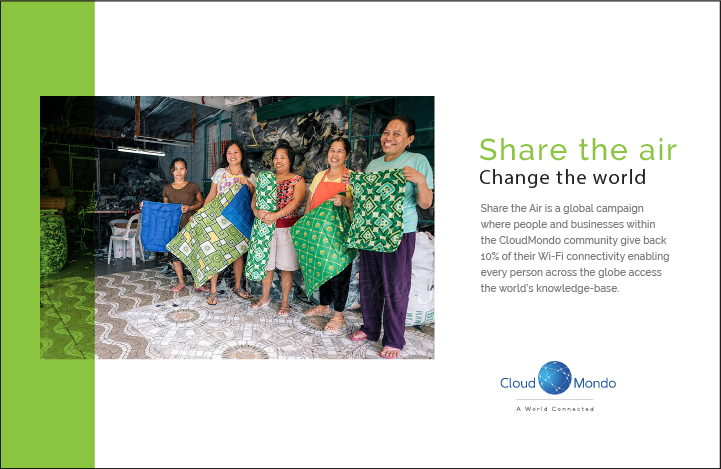
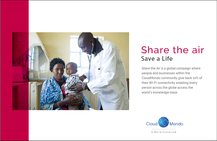
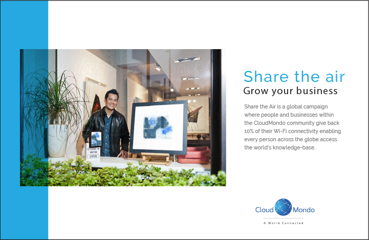
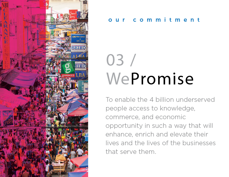
10. Getting Our Message Out
In anticipation of our upcoming launch date, I ideated and prototyped potential messaging and campaigns that would communicate our global strategy and deployment of a gigabit connectivity platform that would enable 4+ billion underserved people and businesses to access the world's knowledge base